“Simplex is as Simplex doesâ€
(Est. 1907) "Simplex was founded in 1907 by the Véronneau family. While the company originally specialized in tools and floor maintenance, it now provides individuals and businesses with an assortment of more than 55,000 different products for rental. Since 1907, Simplex has been a family owned business and proud of its Quebec roots. It is evident that the passion for entrepreneurship inherent with the mission for customer satisfaction is passed on from generation to generation, now reaching the 5th generation of Véronneau since 2016. Winner of Canada's Best Managed Companies since the 2000s, Simplex is now part of a select group of Platinum member companies."
Design by
lg2 (Montréal, Québec)
Related links
lg2 project page
Relevant quote
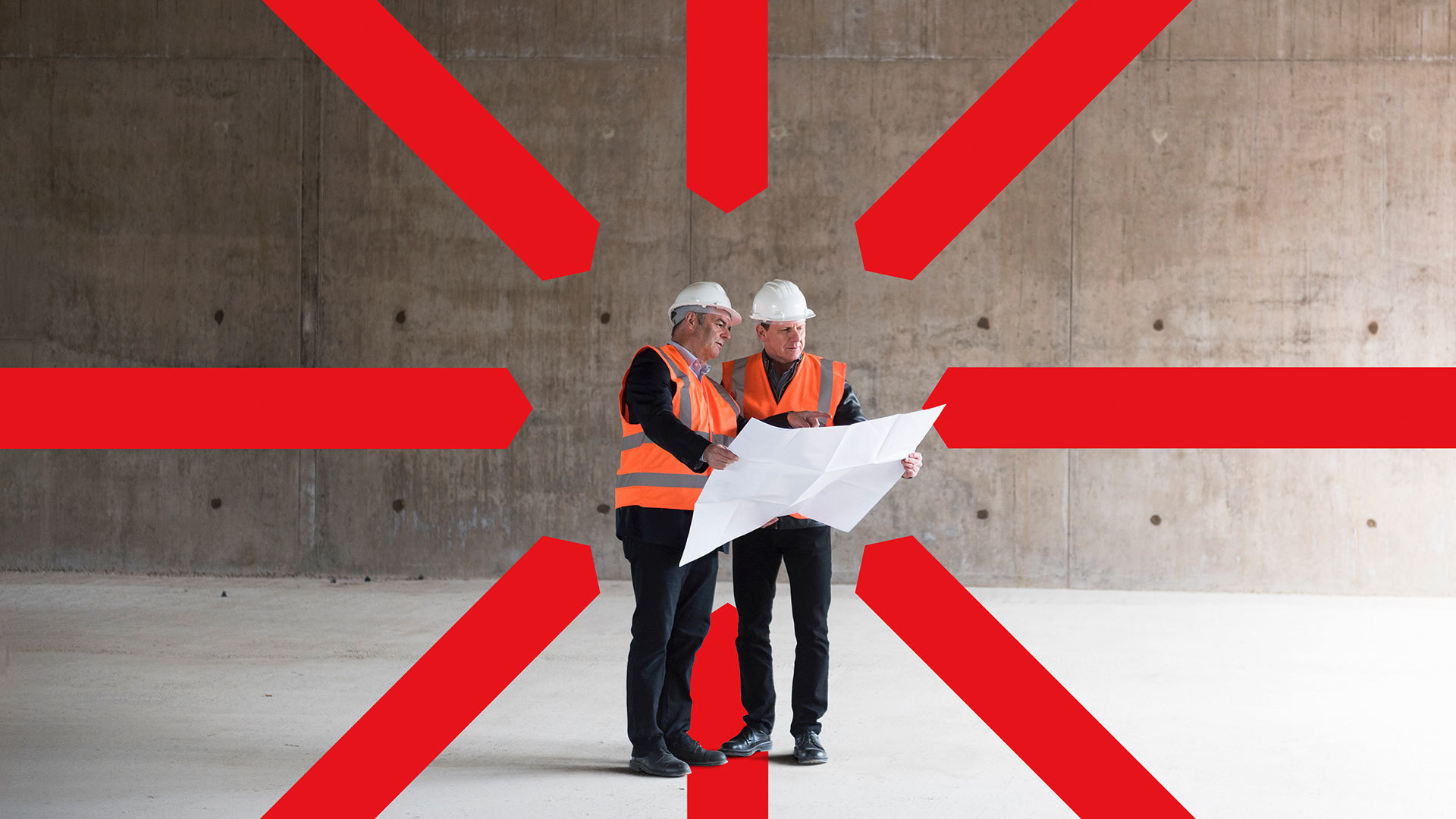
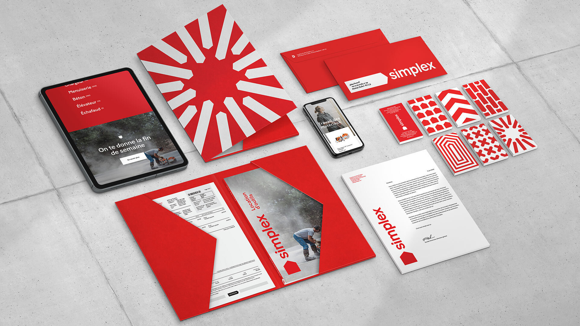
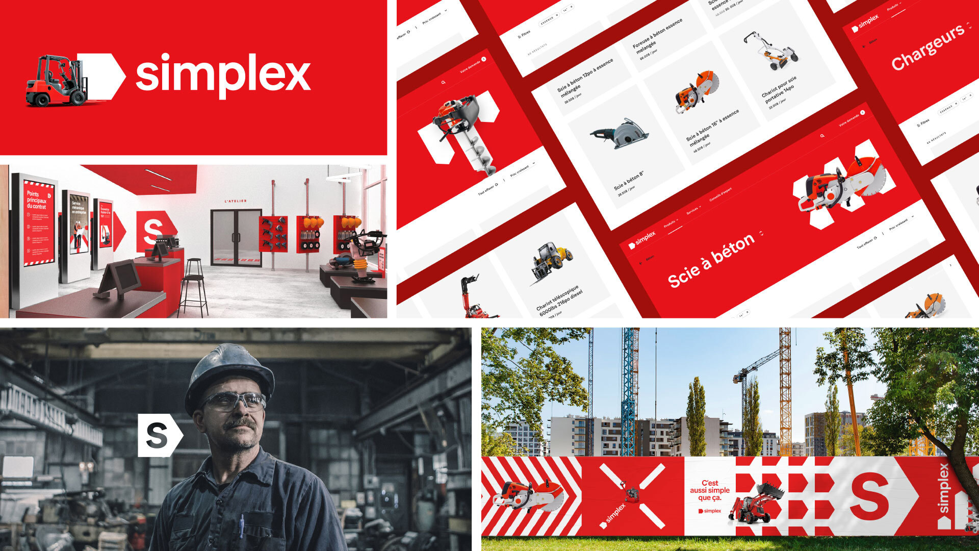
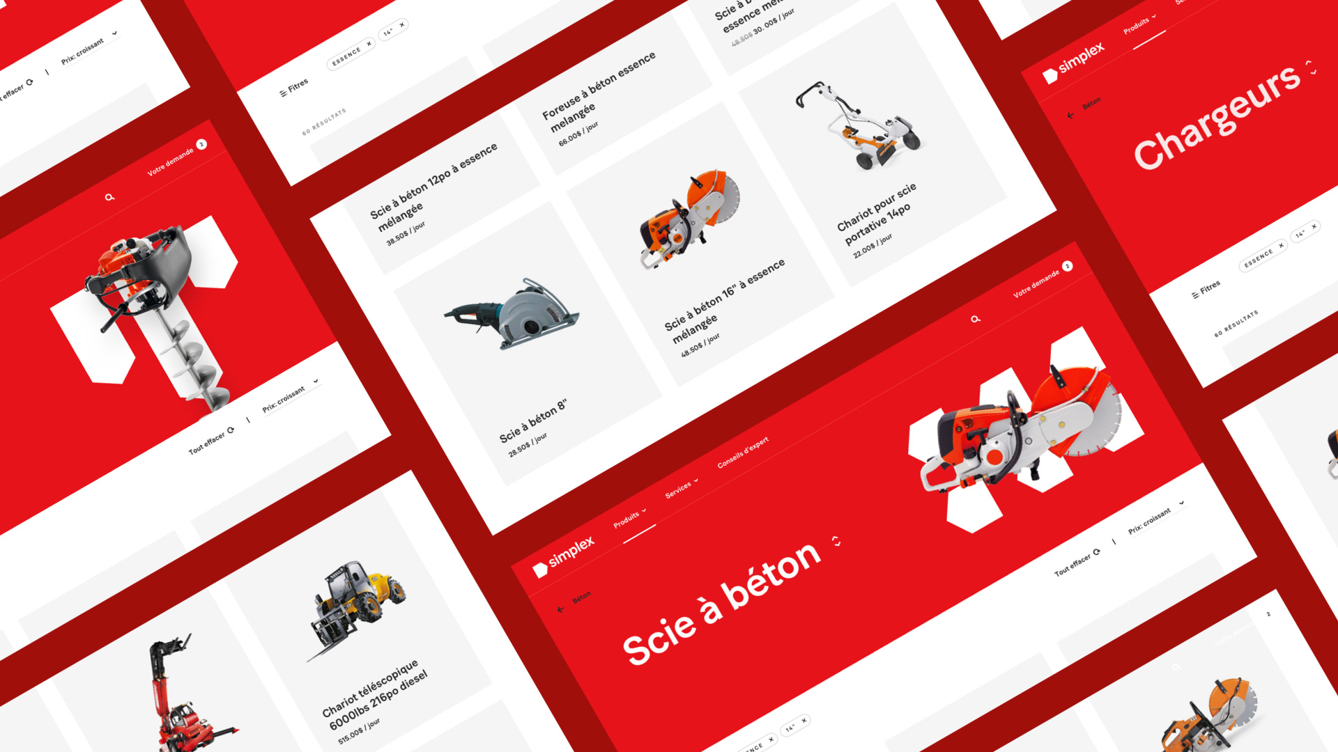
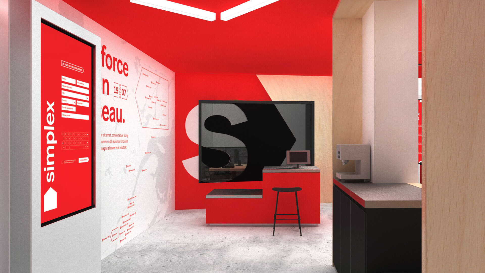
Beyond its deeply human values, Simplex’s foremost objective is to simplify its customers’ lives and support them throughout their projects. The brand positioning had to be anchored in this vision while creating value for customers. This simplicity is captured in the logo featuring an arrow, a core element of the visual identity, that encapsulates the company’s desire to support entrepreneurs and individuals in their various projects. The shape is found throughout the platform to guide and advise customers and create stronger brand attribution using motifs based on the arrow.
Images (opinion after)
Opinion
The old logo was kind of enjoyable in its naïveté, with the construction equivalent of a Dodgers-like swash at the end of the “x†but, yeah, it wasn’t good. The new logo is certainly much more mature and professional looking. Nothing too exciting but, as a potential renter of tools myself, I would have more confidence in renting from a company with the new logo. The icon being an arrow is fine but I also like that it’s a very abstract house on its side, even if residential customers aren’t their main audience. I could do with an uppercase “S†in the wordmark. The flexibility and variety of the arrow device is engaging and is what adds interest to this project, particularly in motion. Even in static form, there is enough variety in how they use different arrow configurations to make it feel dynamic while the broad use of red makes it all very hard to miss. Overall, this is a great identity for a market — tool and equipment rental — that seldom benefits from good design.
|
 | Tweet