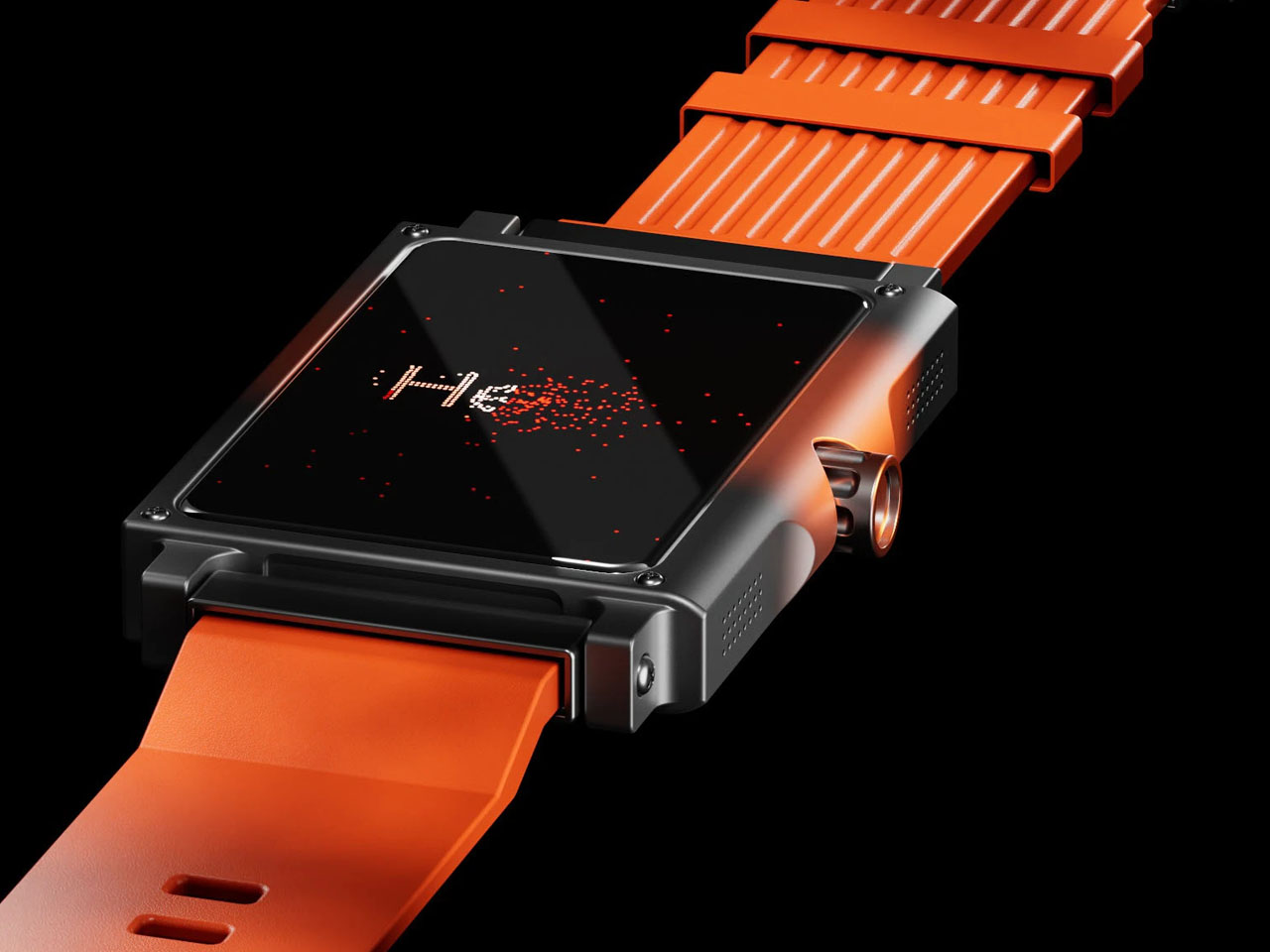
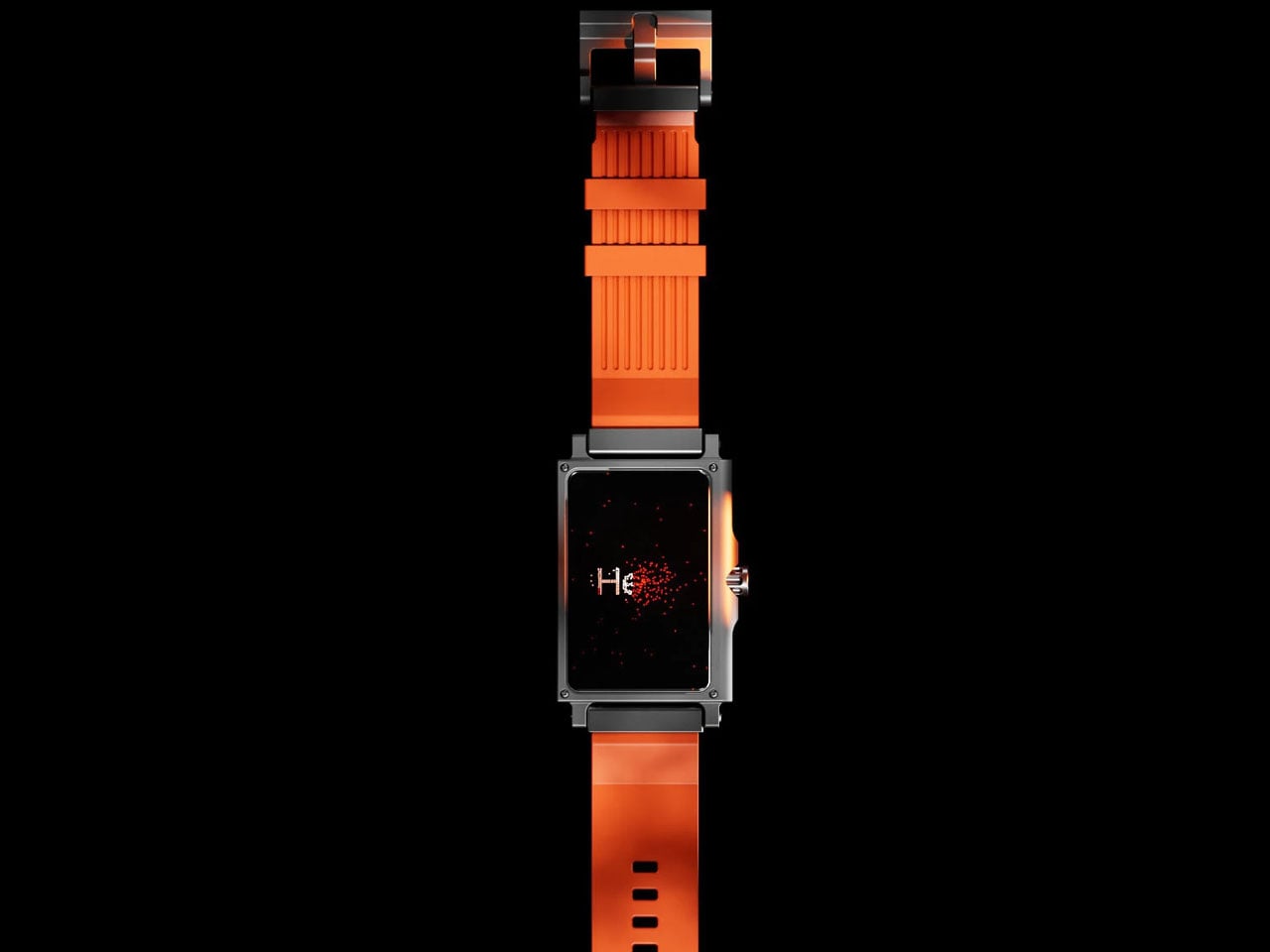
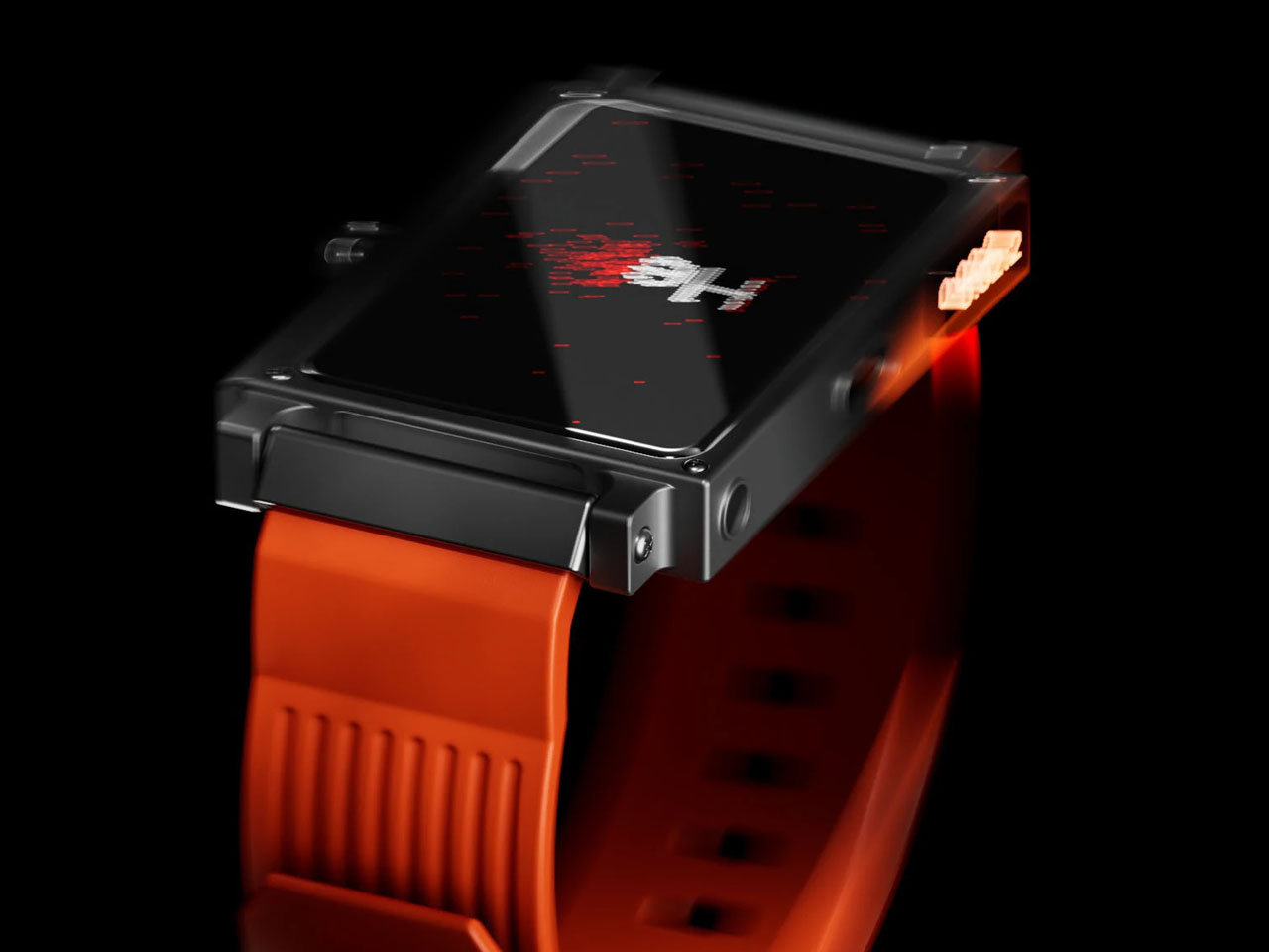
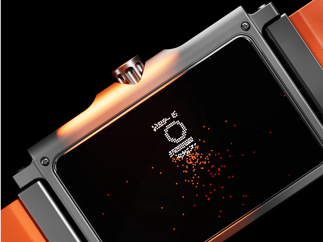
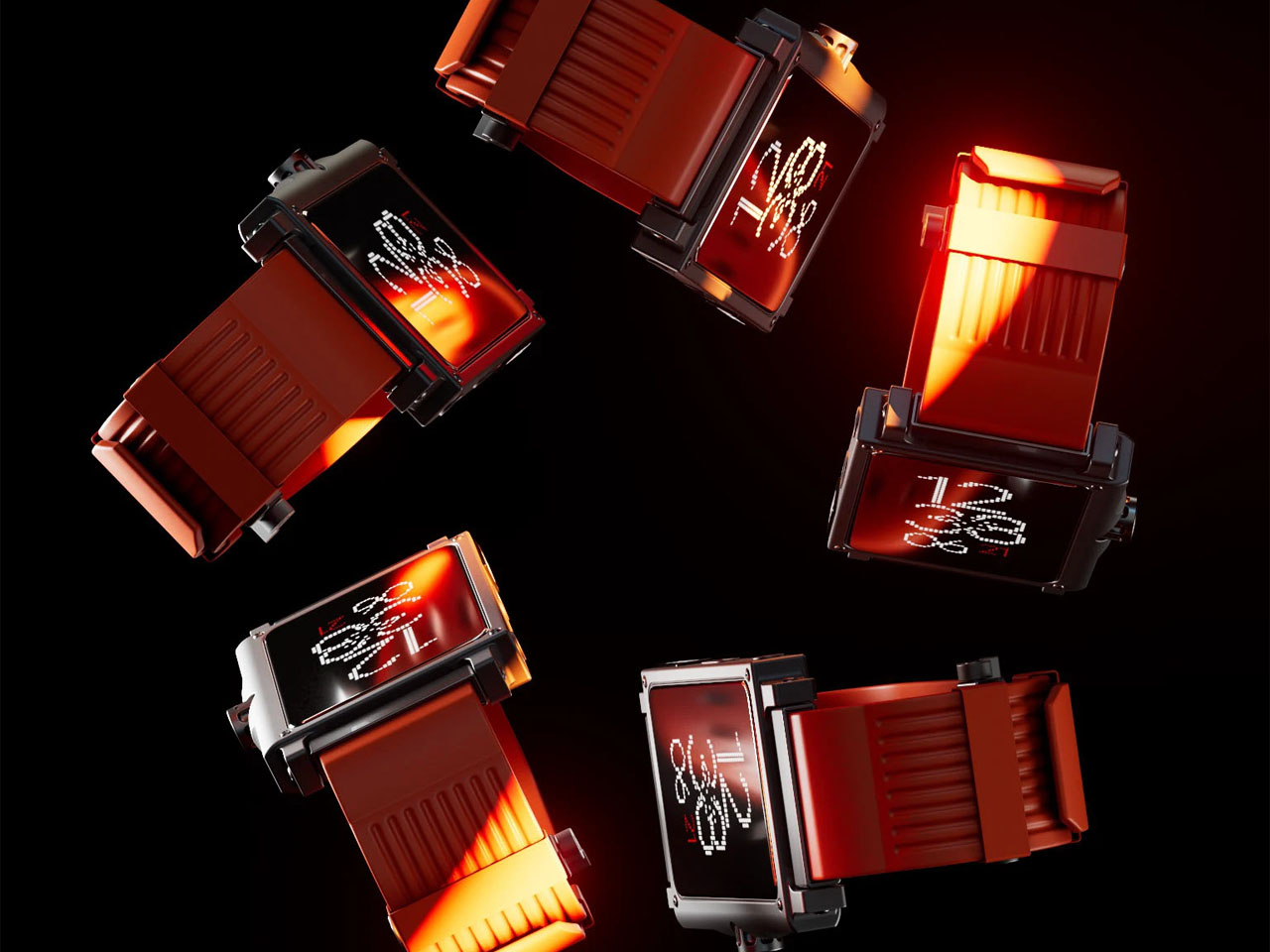
In an era where smartwatches increasingly adopt sleek, minimalist aesthetics and glossy facades, designers are exploring alternative paths that celebrate character over conformity. The Retro‑Future Wrist Tech concept challenges conventional norms with a rugged, industrial silhouette and a deliberately pixelated font that evokes the vibe of early digital watches. This design reframes wearable tech with nostalgic cues and tactile authenticity, diverging sharply from the polished, edge‑to‑edge displays dominating today’s market.
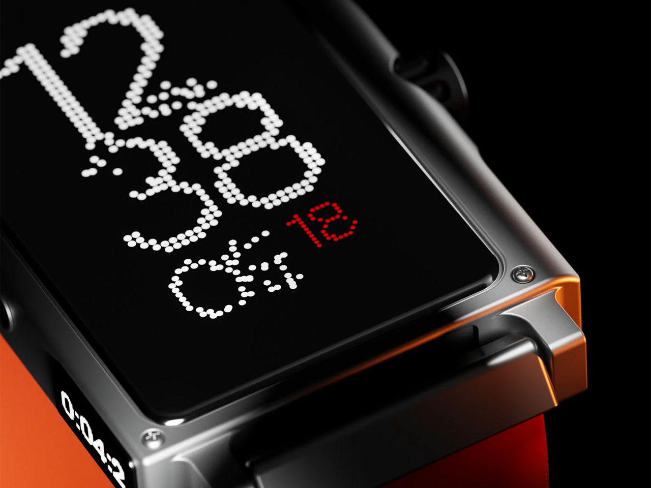
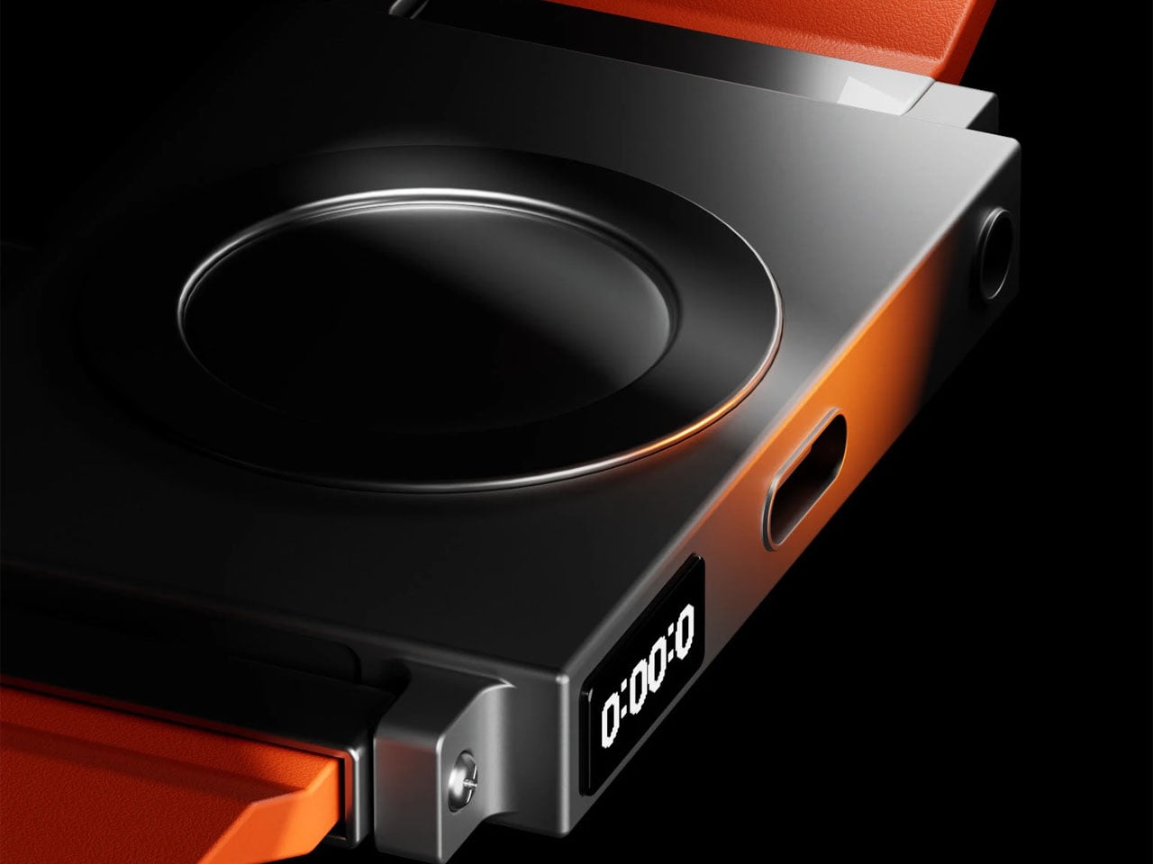
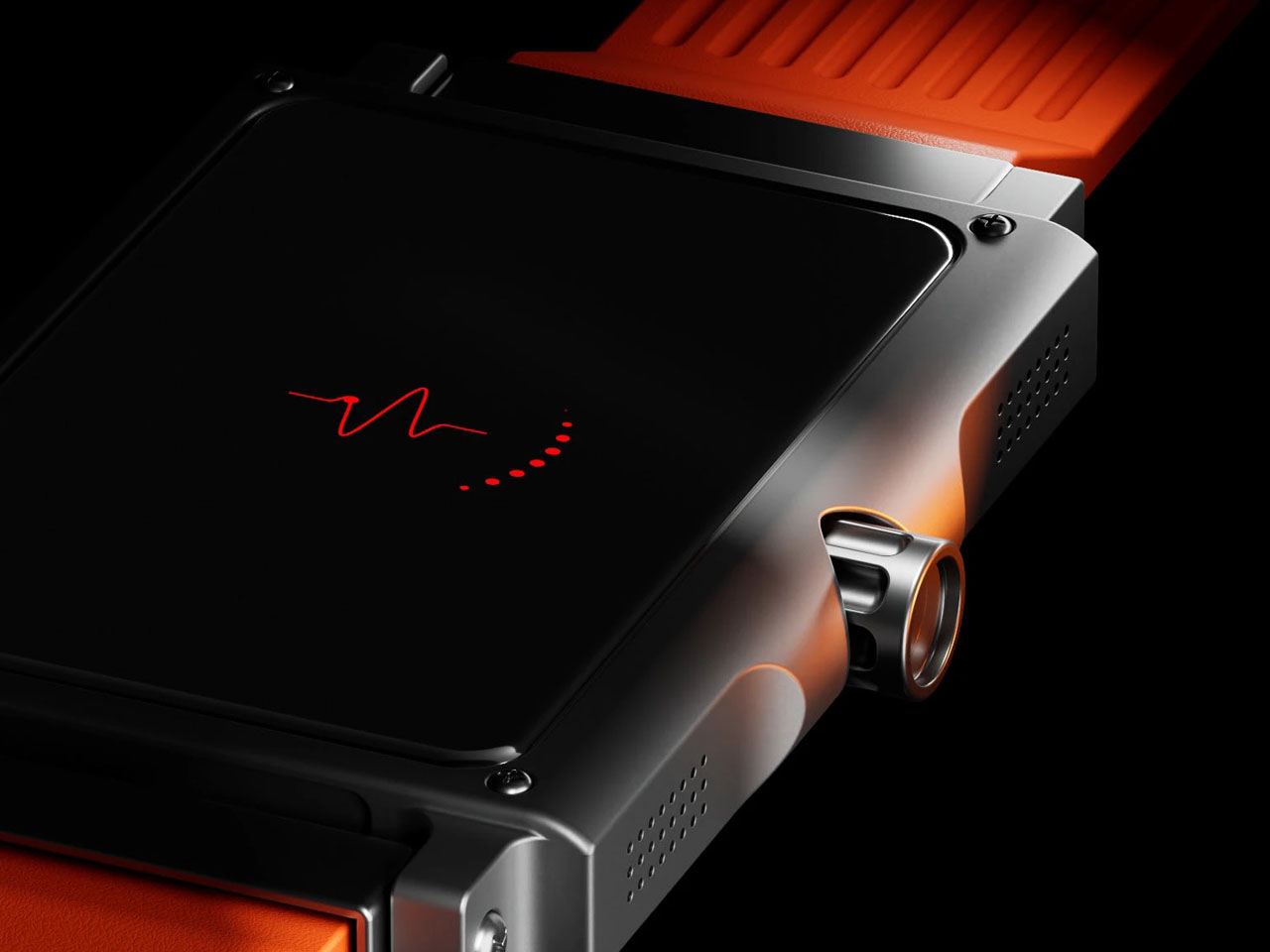
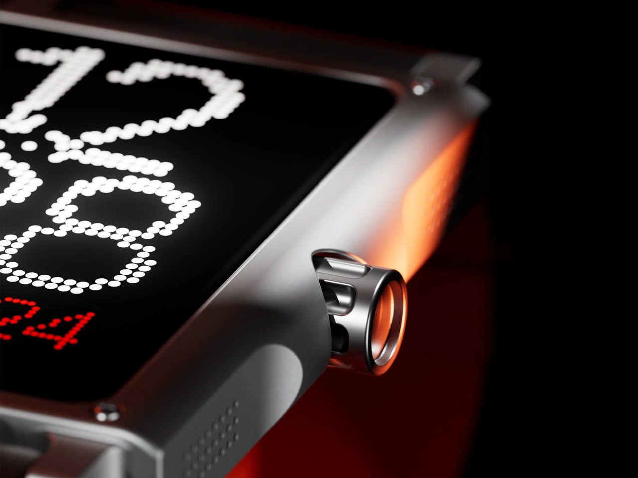
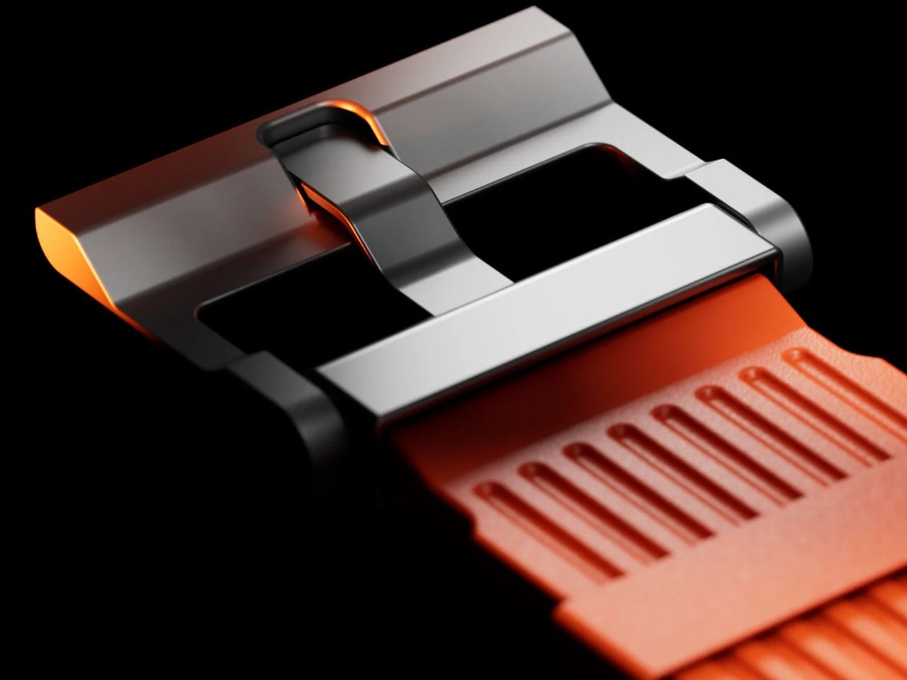
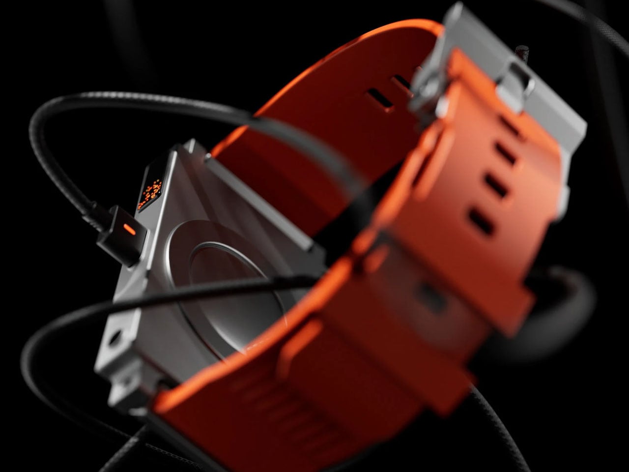
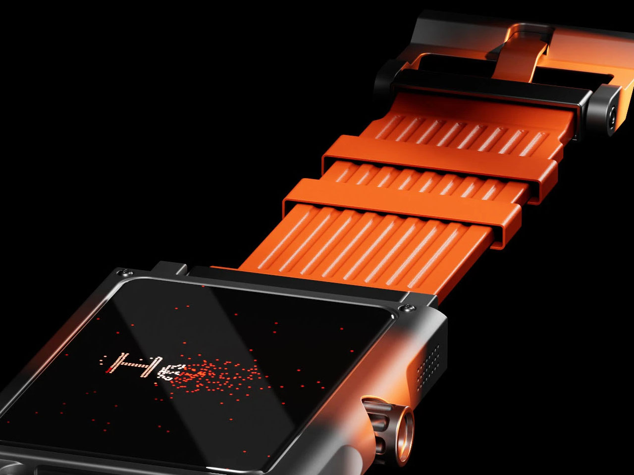
At first glance, the design reminds me of the bold geometry and exposed hardware of Nothing’s devices. Its body appears engineered rather than art‑directed, embracing functional aesthetics. Think robust plastic bezel, visible fasteners, and a screen typeface that wouldn’t look out of place in an ’80s Casio. This aesthetic choice suggests purposeful restraint: each visual element serves a purpose, avoiding superfluous flourishes. The monochrome display and oversized pixel font deliver clarity and charm, reminiscent of Game Boy menus or retro computing interfaces.
Designer: Jacek Janiczak
Under the surface, the concept maintains the essential features modern users expect: notifications, activity tracking, and health monitoring. Yet the keystone here is emotional resonance offering tactile engagement, analog textures, and a visual language that feels more human than glassy. For individuals tired of interchangeable rectangular smartwatches, Janiczak’s proposal presents a refreshing alternative that prioritizes design integrity over compliance with market homogeneity.
This design sits at the crossroads of two distinct movements. On one side is retro‑futurism, characterized by its reverence for past visions of tomorrow in structured forms, chunky materials, and typographic nods to the digital dawn. On the other side lies the influence of Nothing and similar tech hardware that foregrounds honesty in materials, utilitarian construction, and a defiant rejection of minimal blandness. Janiczak successfully merges these with a singular vision: a smartwatch that feels lived‑in, engineered, and surprisingly fresh amid silicon and glass.
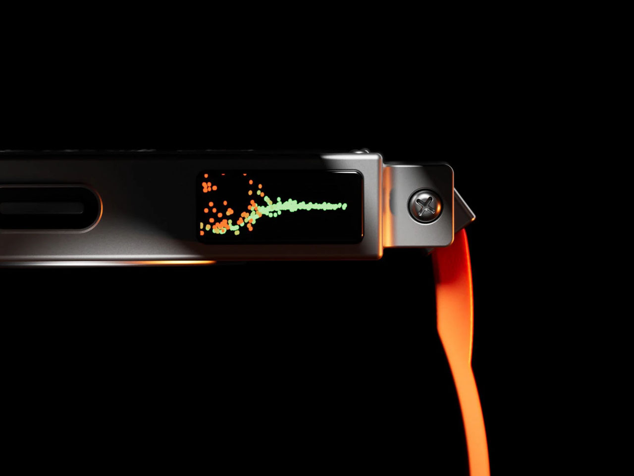
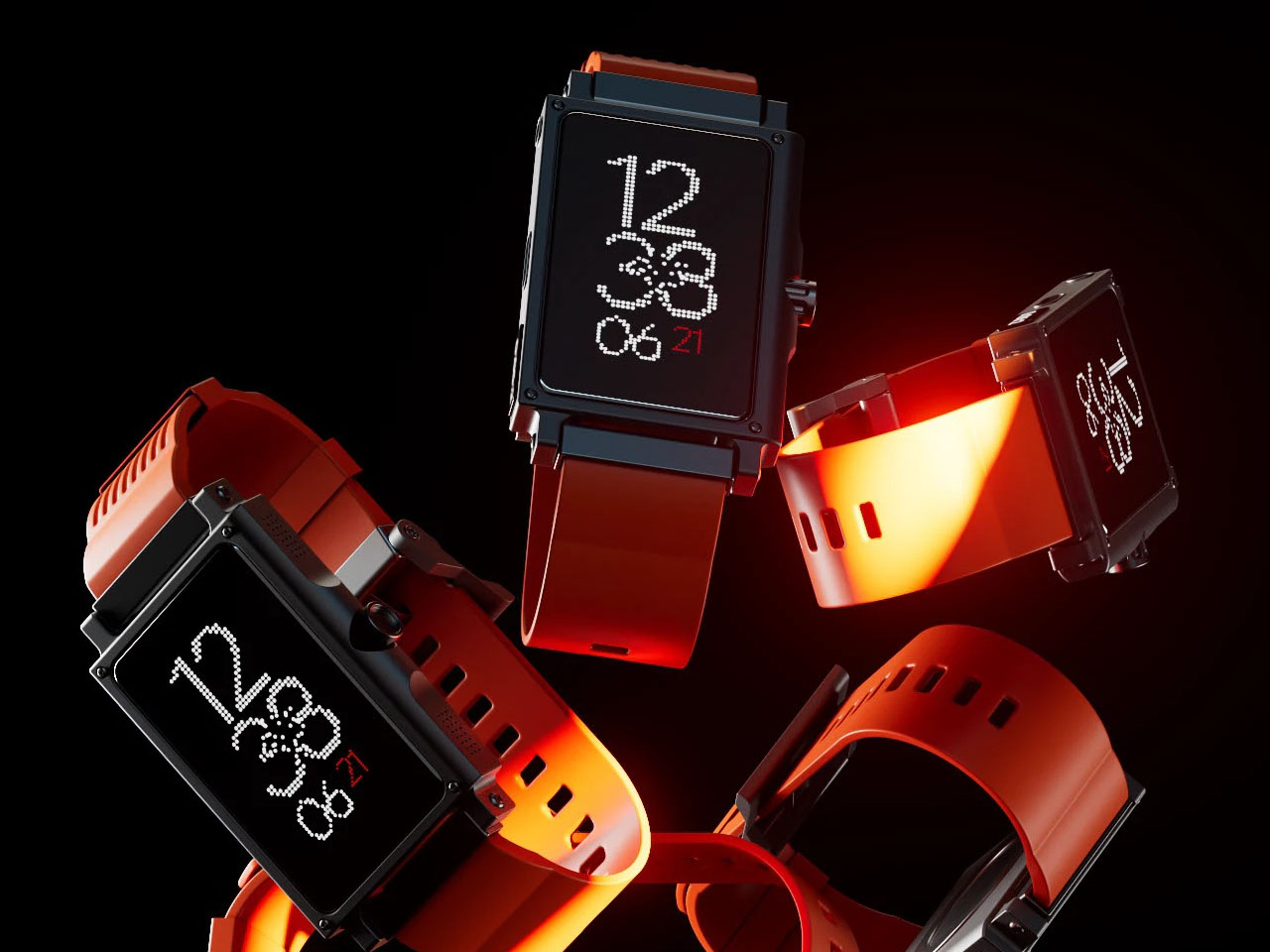
The font choice reinforces the concept’s narrative. Instead of striving for sleek, anti‑aliased typefaces, the sharp, pixel‑perfect characters lay bare the illusion. This is new-age tech, yes… but tech with visible roots. The result feels sincere, playfully even, and disarmingly approachable. It’s easy to envisage a watchface that cycles through digital readouts, chunky icons, and perhaps even simple animations that mimic retro game sprites. Crucially, the concept’s physical framing honed by a thick bezel, screw accents, and robust strap attachments conveys endurance. It tells a story of being tapped, worn, and lived with, distancing itself from devices meant solely to be looked at.
Retro‑Future Wrist Tech may not be destined for mass production, but it asks important questions: What if smartwatches had personality? What if their look reflected craftsmanship instead of assembly‑line precision? Janiczak’s proposal doesn’t just add a new model to the wearable gallery, it offers a reminder of the power of thoughtful design, where form and narrative align to shape inanimate objects into meaningful, memorable experiences.
The post This retro-futuristic smartwatch is rugged by design and precise by purpose first appeared on Yanko Design.
Read More . . .|
 | Tweet