“Crowning Achievementâ€
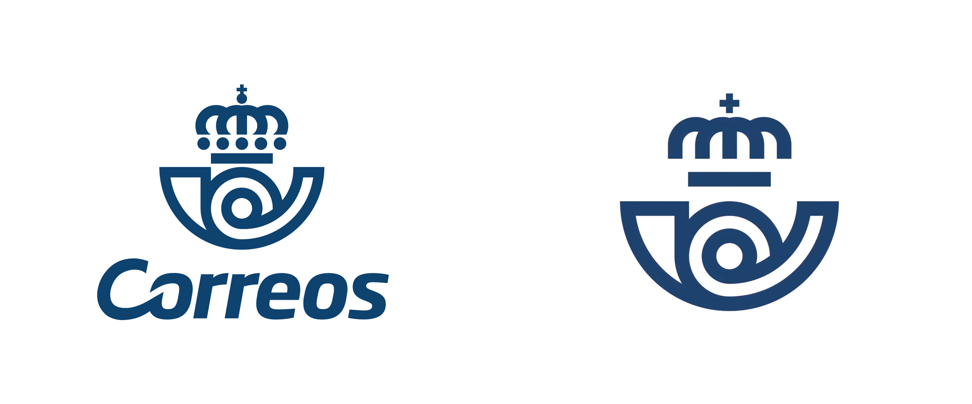
Established in 1716, Correos (formally Sociedad Estatal de Correos y Telégrafos, S.A., loosely translated as "State Postal and Telegraph Society" in English) is the national postal service of Spain. Owned by the state, through its GRUPO SEPI, Correos employs over 53,000 people that help deliver more than 69 million packages and 2.7 million letters annually with a fleet of nearly 15,000 vehicles, including almost 500 electric vehicles. Recently, Correos introduced a new identity designed by Barcelona and Madrid, Spain-based Summa.
Correos, national postal service, is a brand with more than 350 years. Witness of all the changes that spanish society has undergone, it has evolved to adapt to them and to technological advances by launching new courier and parcel services. However, society felt Correos as an endearing brand, traditional but not at all innovative. That's why Correos needed to adapt its identity to reflect its own reality: a company that has been innovating in services since 1756 and continues to do so.
To embrace its essence and communicate it in a more contemporary and direct way to its audience, Correos counted on Summa to develop the brand project. Our task was to update the brand and position Correos as another player in the current industry, leaving behind the times where the brand expressed itself only in its fleet, facades and mailboxes, and covering every outcome across physical and digital media.
Summa project page

We started the project with the study of the symbol, the most important identity element of the brand. The symbol appears today in many more applications than in previous decades, but could not behave in the desired way in small or digital scenarios. Our strategic proposal consisted of applying more oxygen between its lines, redefining some of its elements, and lightening its shapes to turn it into a flexible symbol.
For this, we simplify the morphology of the crown, but maintaining the symbolic recognition of the brand. Anchoring the redesign in the most recognizable element was essential, since the cornamusa is even used as a symbol of urban navigation as well as others such as the Red Cross or the Spanish Police.
Summa project page


The biggest change about the logo is that it has completely dropped its wordmark, which is good because the old wordmark was a little wonky with the italic "C" getting its cursive on with the "o" next to it. Going 100% with the icon only is a bold move and few companies and organizations can pull it off but Correos seems to be poised to do it well with an icon that has been around for 42 years and always linked to the word "Correos" in the past so it's not a huge leap at all to believe that the majority of the audience -- in this case the whole country -- will be able to recognize it. The changes to the icon will probably even pass unperceived as the core structure and elements remain in play. The "cornamusa" (or the trumpet-looking thing) remains mostly intact with a few improvements while the crown has received the most modifications which are fine for reproducibility but I wonder if it lost its crown-ness? Removing the circles for the jewels makes it simpler but I think removing the bling is not ideal nor is the straightening of the curves -- it loses a couple of key visual triggers for "crown". Nonetheless, the overall appearance and recognizability of the logo remains and now performs better across mediums, so that's always a win.
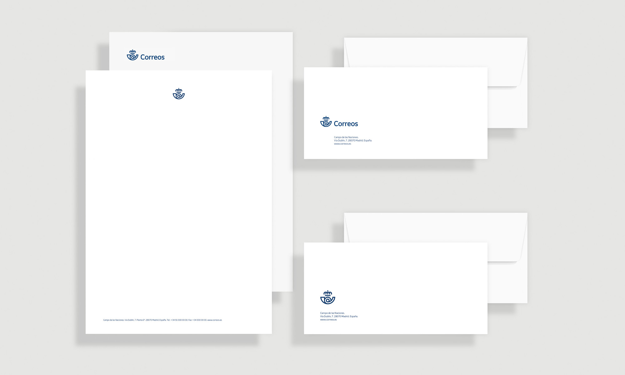
An important element in the renewal of the visual identity for Correos is its new typeface. Together with Monotype, we designed a new font exclusively for Correos that we have named Cartero (Postman) in honour of these emblematic professionals that has shaped the company since its early days.
The new typeface brings elegance and modernity, and reinforces the essential attributes of the new Correos. Its simplicity ensures the proper functioning of it in all types of messages (from corporate to commercial, from digital to traditional environments) and at the same time will make it last over time without losing relevance.
Summa project page
The type family is okay. I like the lowercase letters and the light weight. When they use all uppercase bold, as in some of the videos at the end of this post, it doesn't look as good.
The responsiveness of the icon set is quite nice, going from multi-color and animation to two-color to single-color without missing a beat. I don't usually comment on icon sets because they rarely excite me but this one is both nicely executed and very functional.
From the first urban postman in 1756 to the use of the telegraph or the creation of postcodes in the 80s, the history of Correos is a story of innovation. Especially in recent years, the company has expanded exponentially the portfolio of products and services offered to citizens.
For all this, and taking into account that Correos communicates through multiple channels, it was essential to ensure consistency between the messages. To do this, we created an additional identification element: the label.
Summa project page
We created a visual system based on the label, the fundamental element in sending and receiving of letters and parcels. A modular and flexible system that identifies all the pieces of communication of the brand in all its spectrum.
The label adapts to the different forms of communication, both the main brand and its sub-brands, and will be one of the elements that will characterize the identity of the Correos, as they are today without any doubt the postman or the mailbox.
Summa project page
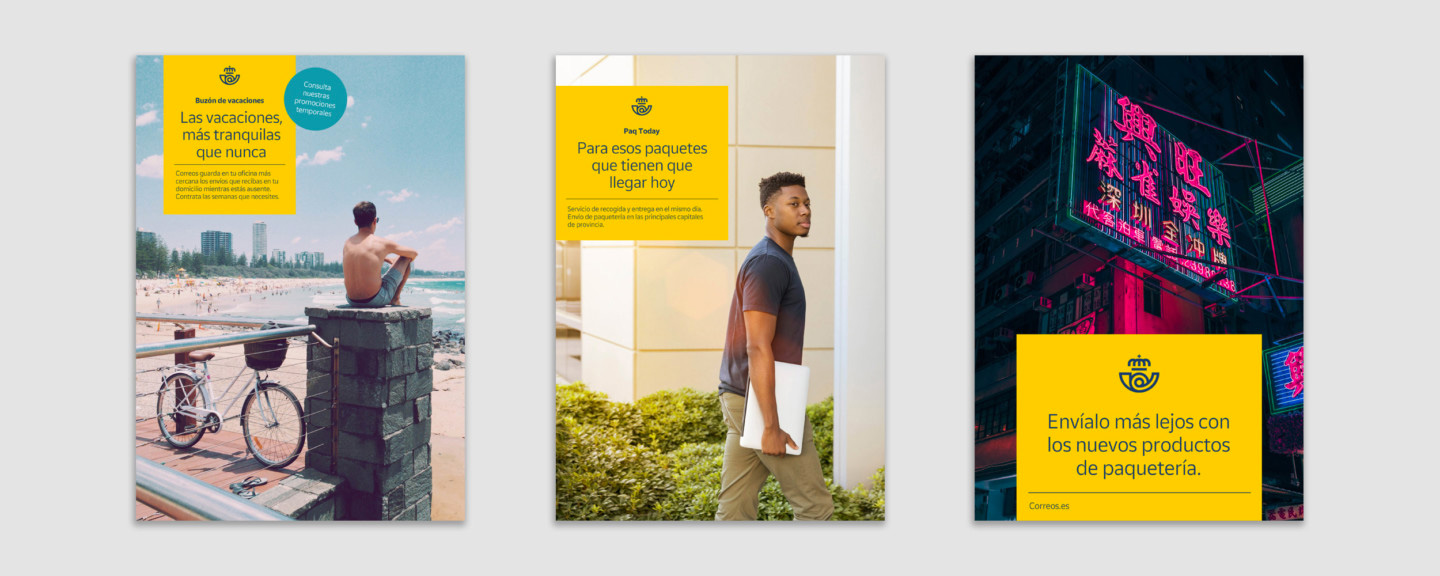
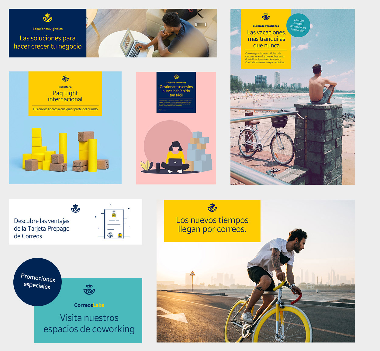
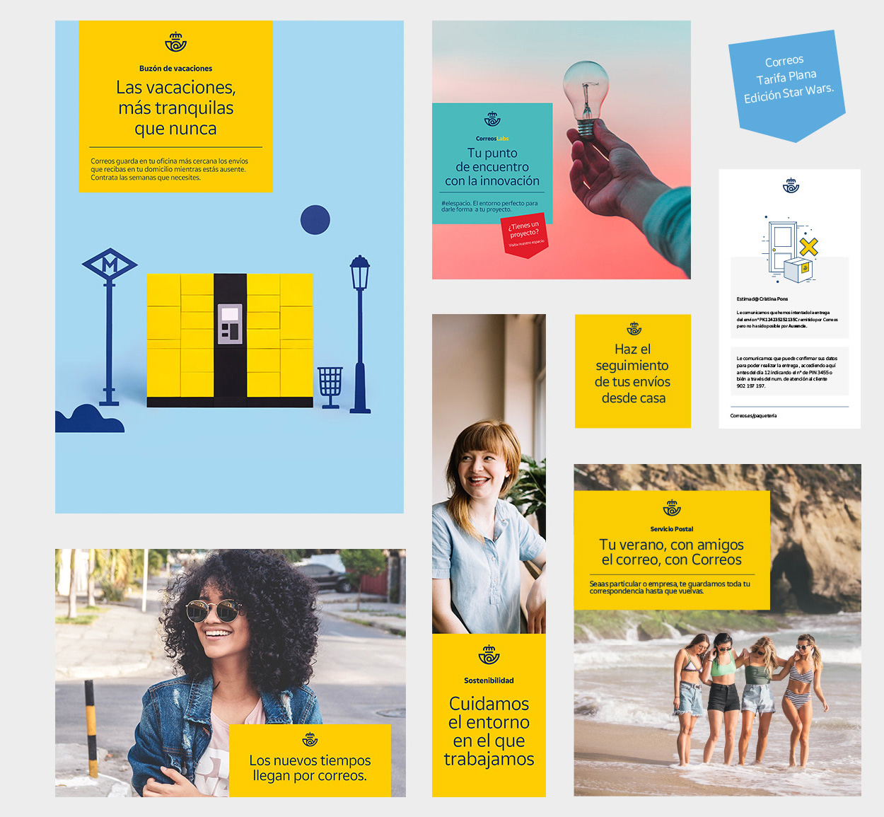
The concept of the "label" as the main identity element for applications makes sense, even if it's not the most exciting. It creates a simple device that in its heavy use of yellow with the logo neatly centered at the top is bound to become easily recognizable. The supporting imagery might need to be less generic and random but maybe in due time that will fall in line a little better.
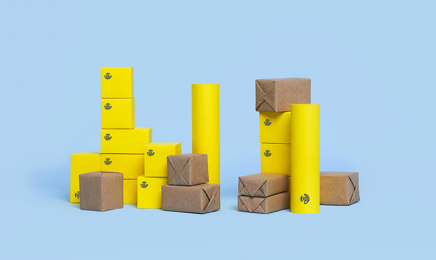
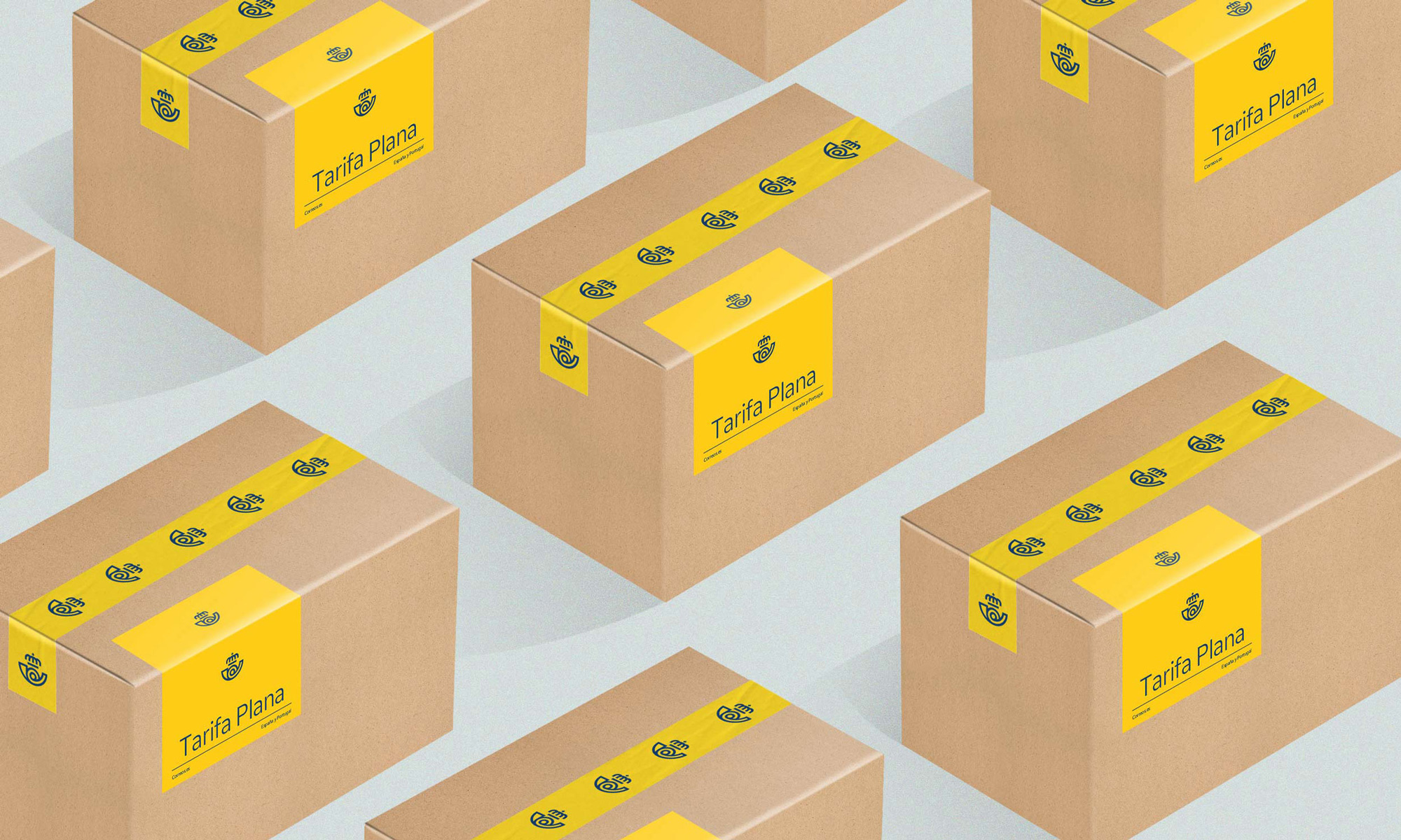

Not the most exciting packaging or labeling. I think eventually doing a kick-ass tape design would do wonders for them.
Correos has more than 50,000 workers among office staff, postmen, support personnel, management, etc. That is why, as part of the project, we consider providing the brand with a pattern that will help give life and dynamism to the pieces directed to the internal public, as well as to corporate events and merchandising.
The pattern starts from the morphology of the cornamusa and brings joy and vitality to the pieces where it is applied, forming part of the "kit" of the brand's identity elements, which are combined according to the audiences it speaks to and the outcomes in which it is expressed.
Summa project page
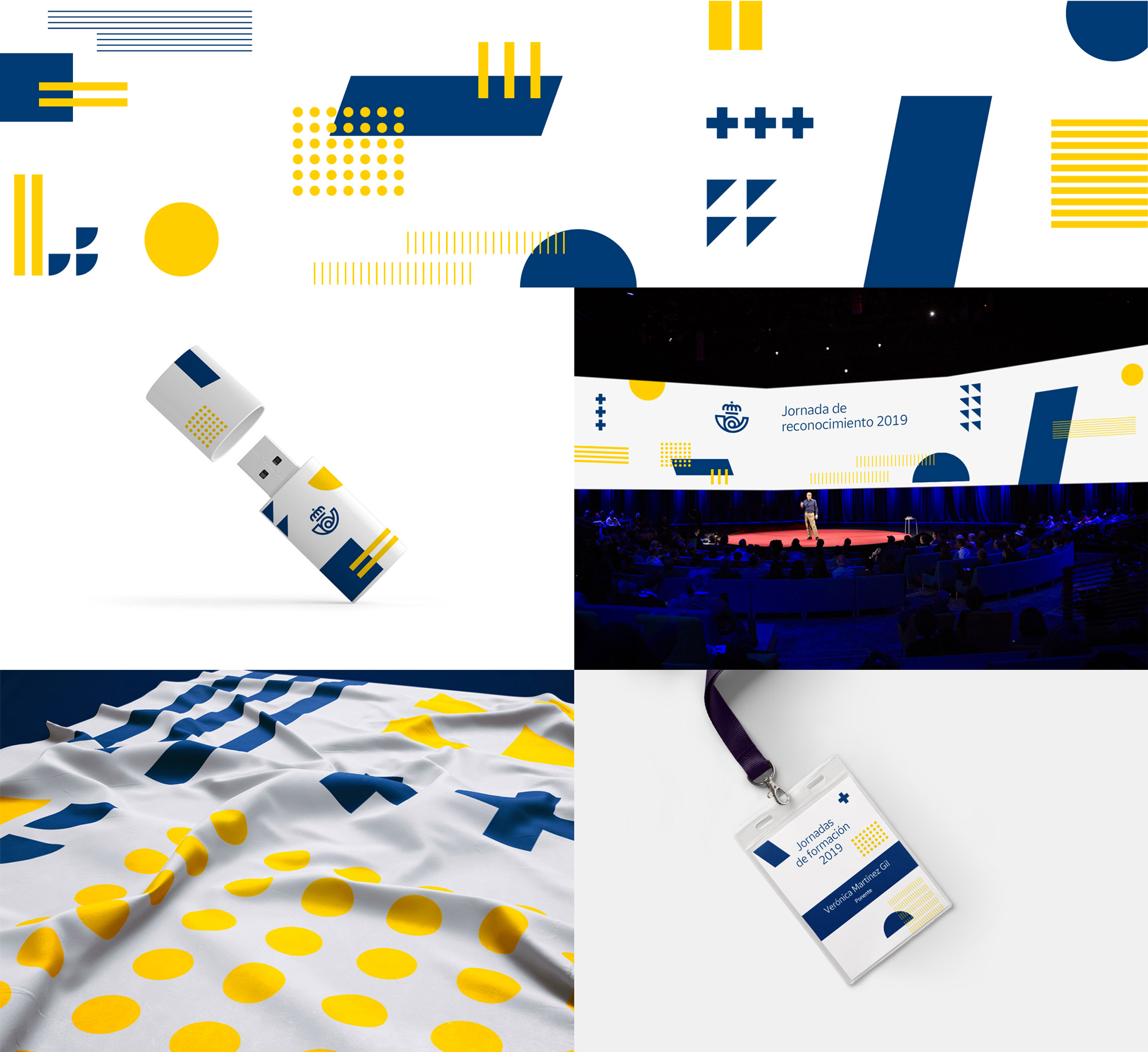
The pattern element is somewhat interesting and is used well in the videos shown at the end but maybe it's too playful? Or too random? Even when being derived from pieces of the logo, it feels like it's from another identity and company or even another industry. I would keep that USB thumb drive tho.
The one undeniable good thing about this identity evolution is the removal of the extraneous elements of the identity in physical applications. There is a great sense of confidence to the new mailboxes and fleet where it's just a bunch of yellow and the icon -- no wordmark, no URLs, no tagline.
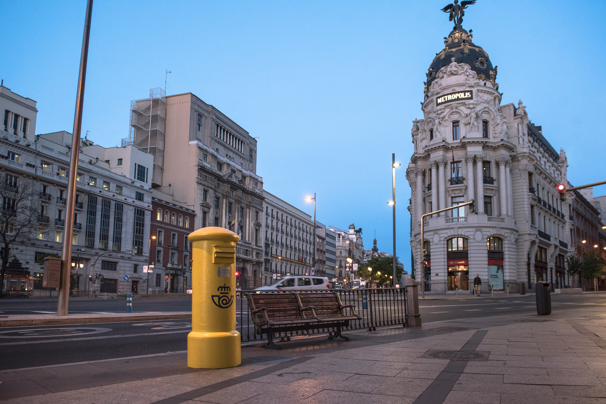
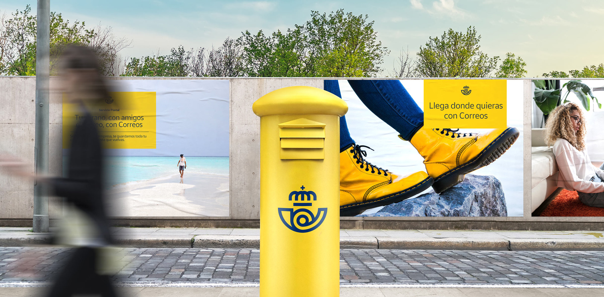
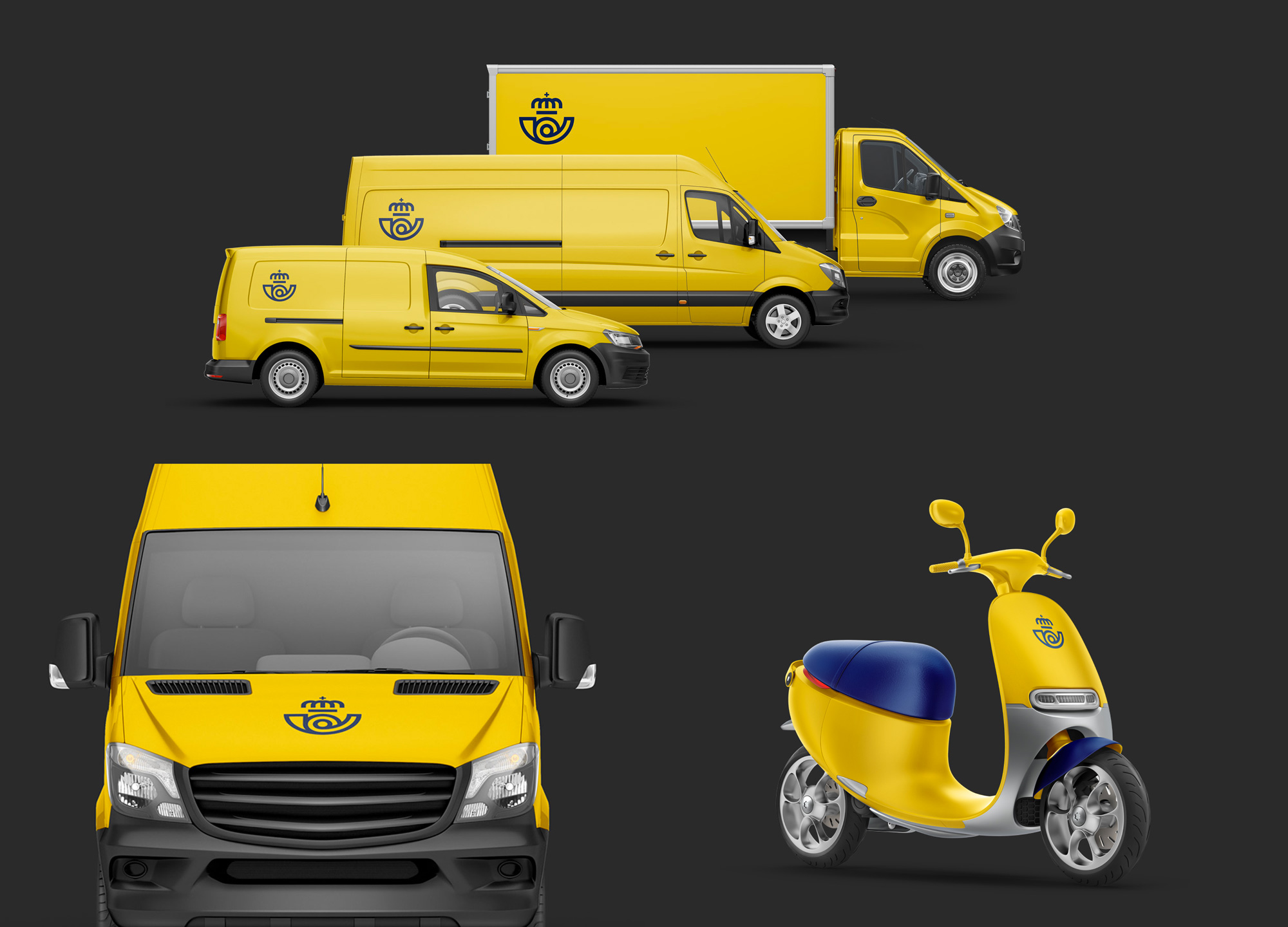
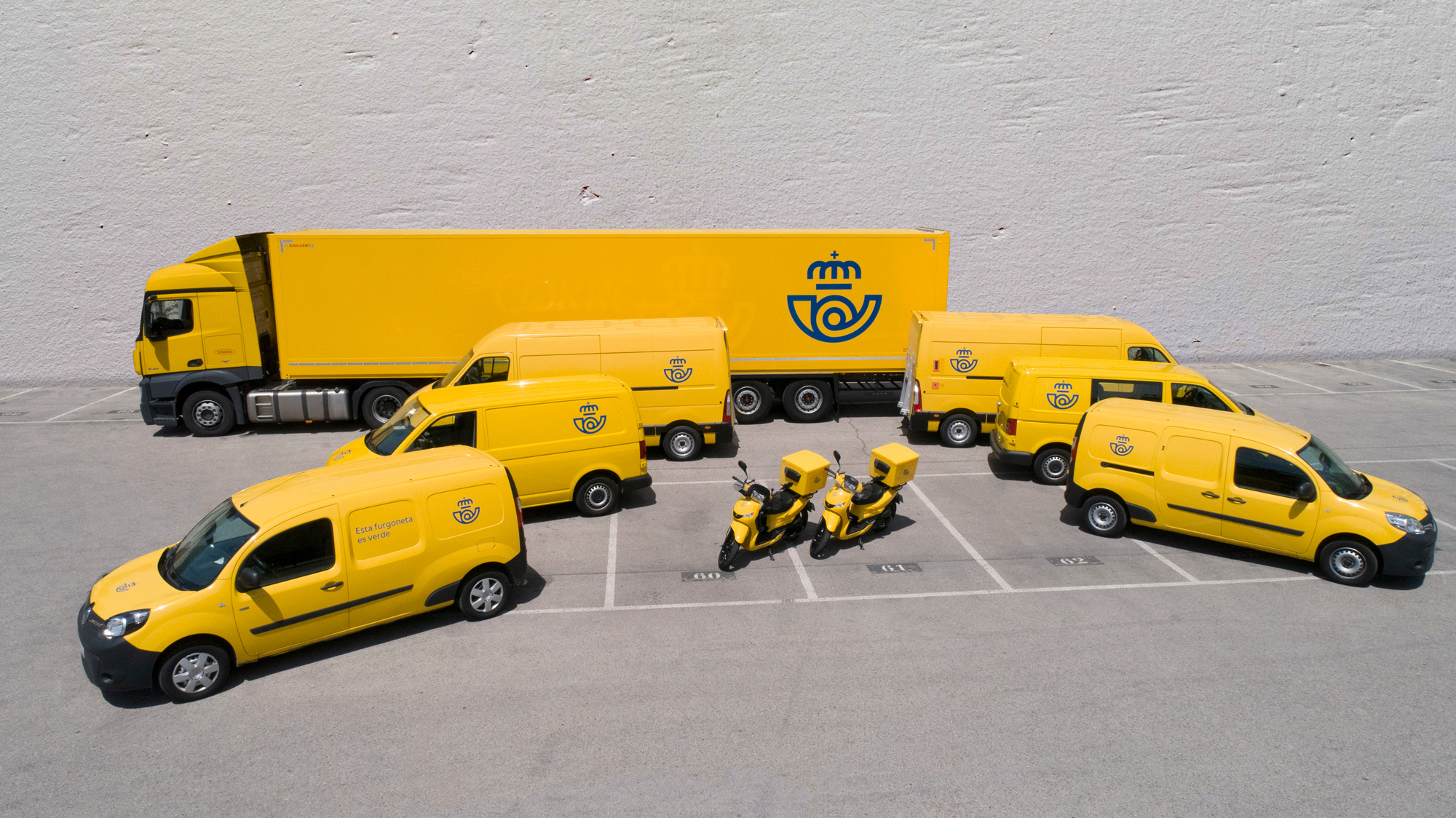
The communication materials could probably be a little better and evoke the same kind of boldness and simplicity as some of the last few images but, overall, this is a solid and confident evolution that the ubiquity of this organization can support, especially when it comes to daily touchpoints like mailboxes, uniforms, and fleet.
|
 | Tweet